Layout consistency not only helps to ensure a cohesive brand look & feel - it also helps to improve design efficiency especially when creating design variations.
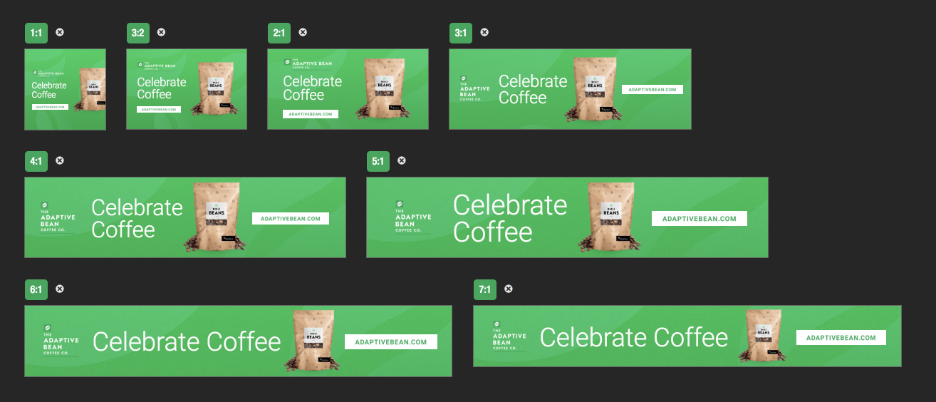
You can use Flexitive’s responsive sizes (1:1, 1:2, 1:3 etc) when creating your first layout, so that when you activate your fixed sizes, they will have a consistent layout foundation that you can then adjust if needed. Flexitive responsive sizes are a great way to build foundational brand designs and custom design templates.
By building the different responsive aspect ratio sizes for your design, the final size will be able to be used to activate any fixed resolution size. A responsive export of the design will be also be able to adapt to any screen size or resolution. For an example of a responsive design in action, see the GIF below.

Starting to Build with Responsive Aspect Ratios
To start building a design with Responsive Aspect, select a Responsive Blank Canvas or Responsive Template in the template selection screen.

Choosing one of these options will automatically link to the All Sizes view for Responsive In-Page aspect ratios. The tabs in the Create Sizes panel allow for viewing In-Page and Fullscreen aspect ratios, as well as shifting between Landscape and Portrait sizes.
Fullscreen aspect ratios are selected based on the aspect ratio of different commonly used screens to view designs, such as 16:9, 4:3 and 5:3. This makes them perfect for designs that will be used as interstitial advertisements, landing pages and digital signage.
In-Page aspect ratios are designed to be used for designs that will be displayed on the same page as other content. These are used for in-page design advertising, website content, responsive wallpapers and fixed-dimension Responsive designs.

Building a design with responsive aspect ratios is done the same way as building a fixed size design. As with fixed size resolutions, enter the editor for the first aspect ratio by clicking on the size. After finishing the first aspect ratio, use it to activate the rest of the aspect ratios that you will need for your project.
When activating responsive aspect ratios, it is recommended that you activate any aspect ratio where your design may be viewed in. This will make it so that when viewing a fully responsive version of the design, it looks good no matter what size it's displayed at,
If you create a fixed size within the design, it will also be able to activate from the closest matching breakpoint. By creating responsive aspect ratios first, you will ensure layout consistency as you activate your fixed resolution sizes.
The Sizes View Toggle
In the Create Sizes Panel, you can navigate between Fixed, Responsive and Social sizes, while also being able to switch between Portrait and Landscape sizes using the Create Sizes Panel tabs.
You will also have the option to use the 'Sizes View Toggle' at the top of the Create Sizes Panel to navigate between All Sizes in your design, the Active Sizes in your design, or the design size you were last editing.

- Clicking 'All' will navigate you to a view with every design size available. Use this view to activate new sizes in your design.

- Clicking 'Active' will navigate you to a view with only design sizes you've activated visible, and filters out any inactive sizes. This view is perfect to review sizes you've already built.

- Clicking the 'Single Size' toggle will bring you into the editor for the last size you were editing, which will be listed in the toggle itself. The 'Single Size' toggle makes it easy to navigate back to editing a size.

Setting Minimum and Maximum Design Dimensions
When creating a design with responsive aspect ratios in Flexitive, you can set the minimum and maximum dimensions for your design.

By setting these minimum and maximum dimensions, you can ensure that your design is never displayed at a size that is either too big or too small for the layout you've created.
Minimum and maximum dimensions can be set using the 'Set Min/Max Dimensions' option in the top-left corner of the All and Active Sizes views.

For more information on how to set minimum or maximum dimensions for your design, check out our support article on Responsive Sizes - Minimum and Maximum Dimensions.
Serving a Responsive Design
Responsive designs are set to adapt to the container that they are served into. In order to make sure that this design is able to adapt to different screen resolutions and sizes, it's important to make sure that the container, or "DIV", that the design is served into is also responsive.
Responsive DIVs, like responsive designs, are set to adapt to changing screen resolutions. Serving a responsive design into a fixed size DIV will not allow for the design to adapt to differing screen sizes and resolutions.